Project Runway S7 Ep10: Personal Prints
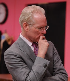
 Let me start this post by saying I am very upset by the goings on last night. I don't agree with the winner. I don't agree with the loser. I didn't agree with half of what the judges said. Not. Happy. Look, even Tim Gunn is concerned. (I did like that everyone used color, but I'm still angry).
Last night technology met fashion when the designers were challenged to create their own textile rather than choosing a fabric from mood. They get to use their HP touch screen desktop (commercial alert!) to create their prints. Several the the designer have tried creating textiles by combining and layering fabrics to make a print. This is the perfect group to trust with this project.
Jay was barely featured in the episode so I knew he was going to be the safe one. His print was vivid and his outfit looks kind of cool. I'm not totally sure about it. I didn't get to see the pieces that went into it. It was quite interesting though.

Seth Aaron created an almost comic book style abstract print. He used it to make a cool jacket which he paired with a yellow tie and a pair of zipper front pants. His ability to create polished, stunning looks every week has really impressed the judges. I know he keeps making jackets, but most designers just keep making dresses. His jackets do vary in structure and style each week. Plus, jackets are difficult to make. Even when they aren't my style, I want his clothes. That's a sign of an impressive designer.

Maya should have won. Maya should have won. Why did Maya not win!? Ahh! The judges loved her look. They all agreed that her print was their favorite (since creating and using a print was the challenge it should have carried more weight). They loved how it was interesting from every angle. She wanted to give her print a sense of movement and succeeded. The only negative comment she got was that she had a lot going on with the styling. I actually thought it suited the dress. I want want want the dress. Maya struggled to make this print work for her point of view, and she deserved this win.

Emilio and his graffiti print won. I don't hate a graffiti print, but I do hate a logo print, which is really what this is. Also, I hate a logo print that doesn't read well. The heart as the O in Sosa (the print says E Sosa) did not translate well when people were just looking at the fabric. I understand that the judges liked the branding possibilities (I could live with this as a lining fabric for everything he made. That would be kind of cool. But I just don't wear ads). I did like the jacket, but I really thought the dress shape was a bit dull. Also, the judges can rave about a jacket all they want, but it doesn't have the print--the point of the challenge. He also just made a dress out of print material. He didn't do anything interesting with the print like the rest of the designers. He should not have won.

Mila found herself in the bottom three. Her print was the worst. (The judges seemed to think it was the second worst). It was just messy stripes in different colors. There was nothing original about the dress. The model couldn't walk in it. It was just boring. The straps, which were the most interesting part, were covered by a little jacket that didn't add anything to the look. I'm not sure Mila can be interesting if she does anything but black and white, and even that is getting boring.

Jonathan got assaulted by the judges for his print. I understand that he didn't like his dress. It wasn't great, but I adored his print! I want a flouncy, whimsical bubble dress made of this material. I want it trimmed with blue ribbons and I want a pretty blue silk scarf to wear with it. He does have trouble reigning in his design. Michael Kors called this jacket a disco straight jacket. The dress would have done better without the backwards wrap jacket. I was a little surprised when the judges didn't get rid of him.

Anthony is out. I'm sad. Where will the entertainment come from. I did understand what the judges said about him creating the same cocktail dress each week and decorating it differently. I really liked his print though (it was purple!). Since this was a print challenge, that should have counted for something, but I don't think the judges ever mentioned the print. I didn't expect him to go all the way, but I was hoping for a little while longer. Tonight he landed the best quote of the episode when he said, "I blame Beyonce for everything that goes wrong in my life." But it doesn't seem fair to blame B for what happened last night. It should have been Mila or Jonathan to go and Maya should have won.

I find it extremely confusing when the judges disregard the point of a challenge when choosing the winners and losers some weeks but rag on designers for missing the point of the challenge other weeks. The decision should have been based on who created an interesting print and used it in a unique way to create their look.
What did you think of these week's winner and loser? What do you think about Emilio? I want to see him go, but the judges seem to love him. What do you think about Mila? Who will go next week? Who are your top three right now? (Mine are Jay, Maya and Seth Aaron).


Comments
That's just amazing talent, he's very impressive. I absolutely love Maya's style and I loved her print the most, it was quite electric, very futuristic almost. I loved Emilio's dress, did not love the print or the jacket... the print was just that, advertising, branding, I hate when designers do that. I thought that Mila would be out, her entire design, both pieces and the pattern are just horrific. It was painful to look at, especially when the model was walking...just horrible and sad. I certainly did not love Johnathan's stuff, his print was interesting, but not in the way that he used it. And I am SOOOOOOO sad that Anthony was kicked out, he was wonderful and such a pleasure to listen to. I'd love to meet this guy some day, he's amazing! Although I didn't like his dress this time, too messy.
I am not sure what the judges were thinking this week. They criticize Anthony for doing the same thing, when Mila does the same black and white every time, and when she doesn't, she flops horribly.